HOW TO STYLE A CREDENZA WITH KIYONDA POWELL
Kiyonda Powell is a DC-based interior designer recently featured at The Aspire McLean Showhouse 2020, where she designed a bold and beautiful recreation room. She created a step by step guide on how to style a credenza, which can exist as a stunning and functional centerpiece in a living room or entryway when executed well.
Read more below:

HOW TO STYLE A CREDENZA
Start with furniture you love that will speak to the overall design. Pick a credenza that speaks to you! Whether modern, vintage, or a family heirloom, find a credenza, sideboard or buffet that will be an exciting addition to your space. And don’t be afraid to make some changes to it. For the Aspire Showhouse McClean, I started with a vintage credenza/buffet, had it painted with Sherwin Williams Mountain Fig in a high gloss, updated the hardware and added legs - both in a brass finish.
Create a focal point. Hanging artwork, a mirror or plants above the credenza can draw the eye into the space and make it part of the overall design of the room. For the Aspire House, I worked with artist Shaunte Gates who provided the oversized art with mixed media and colors that worked with the room.
ACCESSORIZE THE CREDENZA
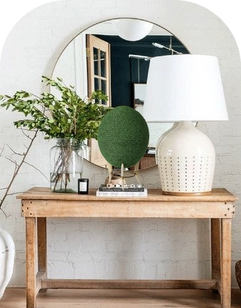
Find accessories that won’t take away from the focal point. Be thoughtful when considering what to place on top of the credenza. Make sure the scale works so that a vase isn’t so large that it overpowers the design, for example. When I style the surface, I focus on using items that are not too tall or oversized so it does not take away from the art itself.
Start with a centerpiece. Once you determine scale, find a strong piece that will bring interest to the area. For this design, I chose the Amur Table Lamp. It is a statement piece, sculptural and the gunmetal finish and warm glow of the light created intimacy.
Choose functional items. A credenza or sideboard is ultimately meant to be a functional piece of furniture. It is made for serving food or drinks and storing dinnerware, so use it as an area that works for your needs. I created a welcoming beverage vignette with a vintage tray and walnut wood ice bucket to add warmth to the glassware.

ADD FINAL TOUCHES TO THE DESIGN
Style with final touches. Once you choose glassware or dishes that best suit your needs, don’t forget to style them! Just stacking up glasses or dishes will make the space look like overflow storage, but adding intentional accents will make it look thought out and inviting. I took a tall glass pitcher with gold accents and filled it with limes so the glass did not “disappear” into the wall.
Add something natural. Bring something organic into the design to add life, color, and some natural movement. Consider flowers, seasonal grasses, dried arrangements, or living houseplants. I consulted with my floral designer, fleursDC, to craft an arrangement that was low and could stretch across the center of the credenza using willow branches and orchids to create a beautiful rustic look with a fun floating effect.
Kiyonda Powell is a Washington DC-based interior designer and founder of Kiyonda Powell Design Studio. Her relaxed and casual design aesthetic is combined with her unique personality and style. Powell’s work has been featured in The Wall Street Journal, Elle Decor, Harper’s Bazaar, House Beautiful, and Aspire Design and Home Magazine. For the past 17 years, she has helped her clients transform their modern homes to better reflect their own personal style. Learn how to create an expert-level gallery wall using her tips above.


Leave a comment